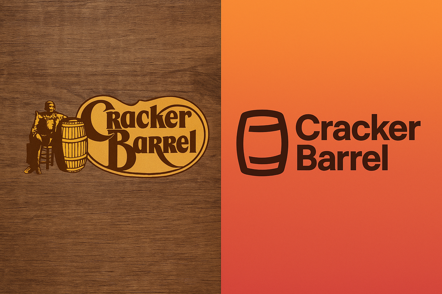
If you’ve driven down a highway in America, chances are you’ve seen the rustic wooden signs of Cracker Barrel and maybe even pulled in for some country-style cooking. But in 2025, this decades-old brand is taking a big leap into the future with a full-scale rebranding effort that starts with a new Cracker Barrel logo rebrand. This change has sparked curiosity, debate, and even controversy, as loyal fans question why the brand would touch such a nostalgic icon. So, what’s really going on behind this major shift? Let’s break it down.
The New Logo Explained
The new Cracker Barrel logo rebrand is a significant departure from the traditional look that most people associate with the brand. Gone is the old-fashioned barrel paired with the rustic font that felt like a trip back in time. The updated design is sleeker, more minimalistic, and optimized for digital platforms.
The logo now emphasizes simplicity, bold typography with cleaner lines, muted yet modern colors, and a subtle nod to its heritage with an abstract barrel icon. This isn’t just about aesthetics; it’s about functionality. In an era where logos need to look sharp on everything from smartphone apps to social media avatars, a streamlined design is more practical.
According to
Statista, over 85% of brand engagement now occurs on digital platforms, which means logos designed for physical signage often don’t translate well online. By modernizing its logo, Cracker Barrel is positioning itself to stay relevant with younger, tech-savvy audiences.
Why the Rebranding?
So why would Cracker Barrel take such a bold step when its image has been synonymous with comfort, nostalgia, and tradition? The short answer: survival.
The casual dining industry has been under massive pressure, with younger consumers leaning toward fast-casual concepts and delivery-friendly dining. Chains that once thrived on highway traffic have had to rethink their strategies in a world dominated by DoorDash and Uber Eats. The Cracker Barrel logo rebrand signals a desire to attract not only its traditional customer base but also younger generations who might otherwise overlook the brand.
Another reason is competition. Brands like Denny’s, IHOP, and Applebee’s have already updated their logos and marketing to appeal to modern audiences. Cracker Barrel can’t afford to look stuck in the past while its rivals push sleek new identities.
Beyond the Logo: Full Brand Refresh
A new logo is rarely just about the logo. This is part of a broader brand refresh that includes restaurant redesigns, updated menus, and a digital-first customer experience. Cracker Barrel has hinted at modernized interiors with warmer lighting, streamlined furniture, and a blend of rustic charm with contemporary elements.
The brand is also expected to lean heavily into technology, think QR-code menus, mobile ordering, loyalty apps, and even AI-driven personalized offers. It’s not just about how Cracker Barrel looks but also about how it functions in today’s fast-moving dining landscape.
This is where
logo design services come into play. The rebrand is a textbook case of how professional design can transform a brand identity while maintaining its core values. By working with
expert logo design services, Cracker Barrel ensures that its visual identity isn’t just trendy but strategic, crafted to serve the brand’s long-term goals.
The Strategy Behind the Move
Every major rebrand is guided by strategy, and Cracker Barrel’s is no different. The core strategy here seems to be balancing nostalgia with modern relevance. The company knows its brand equity lies in tradition, but it also knows younger customers value authenticity, convenience, and style.
By rolling out a logo that is both simplified and symbolic, Cracker Barrel is betting on bridging that generational gap. The move also positions the brand better for digital expansion, merchandising, e-commerce, and even virtual dining experiences.
From a marketing perspective, this is also about storytelling. The new logo allows the company to reintroduce itself to the public, control the narrative, and generate buzz around its future direction. For businesses considering their own rebrands, this demonstrates how vital
logo design services can be in crafting a logo that does more than look good; it communicates vision and strategy.
Public Backlash and Criticism
Of course, no major logo change comes without pushback. Loyal fans of Cracker Barrel have taken to social media to voice their disappointment, saying the new design erases the warmth and nostalgia they associate with the brand. Some argue it looks too “corporate” and lacks the personality that made the original logo iconic.
This backlash isn’t unusual. In fact, history shows us that most major logo changes—from Starbucks to Gap- are initially met with criticism. According to
Statista, nearly 60% of rebranded logos face negative initial reactions before customers eventually adapt. The key will be whether Cracker Barrel can weather the storm and use storytelling to explain the “why” behind the rebrand.
Financial Fallout
The big question: how will this affect Cracker Barrel financially? In the short term, rebranding is expensive. Updating signage, menus, websites, apps, and marketing materials across 600+ locations requires millions in investment. Add in new restaurant renovations and digital rollouts, and the costs climb even higher.
But Cracker Barrel is clearly betting on long-term gains. If the Cracker Barrel logo rebrand succeeds, the company could see increased relevance among younger audiences, stronger digital sales, and renewed growth in a market that has seen many casual dining chains struggle.
However, if the backlash lingers and customers feel alienated, the rebrand could backfire. This is why careful strategy, communication, and consistent brand experience will be critical in determining the financial outcome.
Final Thought
Rebranding is never easy, especially for a heritage brand like Cracker Barrel. But as dining, technology, and consumer expectations evolve, so must the icons we’ve grown up with. Whether you love it or hate it, the new logo is more than a design; it’s a statement of intent. And for Cracker Barrel, that intent is clear: to stay relevant for generations to come.


