

From 90s To Today | The Evolution Of Web Design
Web design has come a long way, from those old-school, clunky pages to the sleek, interactive experiences we see today. As technology keeps evolving and users expect more, websites have become so much more than just digital brochures. They’re dynamic, ever-changing spaces that help define a brand and shape how customers interact with it. At The Web Unity, we specialize in merging innovative strategies with cutting-edge website design and development services, empowering brands to thrive and adapt in the ever-changing digital landscape.
In this article, we’re diving into how web design has evolved over the years, what’s been driving those changes, and where things are headed next.
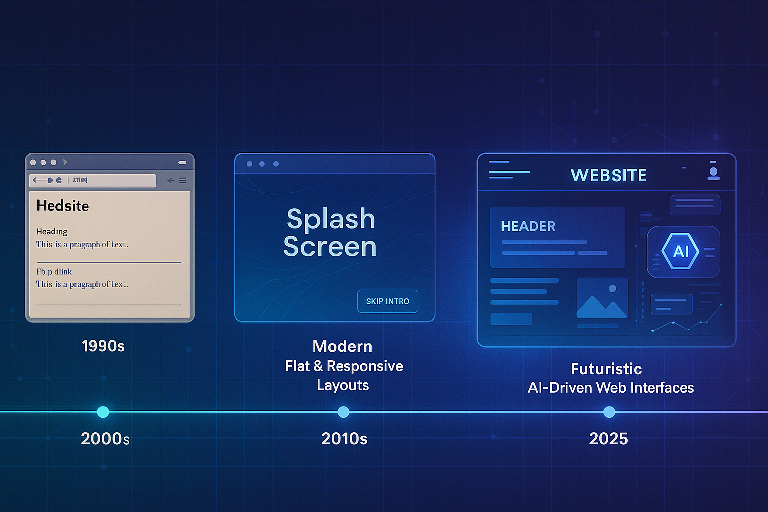
The Early Days: Static Simplicity (1991–1999)
Back in the early days of the internet, websites were super simple—think of Tim Berners-Lee’s first site. They were all about function, not looks. No images, no fancy layouts—just plain HTML text and links.Design-wise, it was as basic as it gets:
- Simple HTML tags like <p> and <a>
- No CSS styling yet
- No interactive features
- Tables and frames were used to piece together the page layout
The Flash Era: Multimedia and Motion (2000–2007)
Back in the 2000s, websites started getting a lot more exciting, thanks to Adobe Flash. Suddenly, the web was filled with movement, sound, and creativity. It was the start of a bold, experimental era online.Some of the standout trends were:
- Eye-catching splash pages with cool animations
- Background music is playing as soon as the page loads
- Flashy intros that felt like mini-movies
- Hover effects and interactive menus that made browsing more fun
The Rise of CSS, Grids & Design Patterns (2008–2013)
This period marked the shift from Flash to CSS-based styling, giving designers more control over layout and appearance without compromising performance.Key developments:
- CSS2 and CSS3 adoption
- Introduction of grid systems
- External stylesheets and modular design
- Focus on semantic HTML
Mobile-First and Responsive Design Take Over (2013–2017)
It wasn’t long before mobile usage just blew up, and that really changed the game for designers. Suddenly, they had to rethink everything. That’s when responsive website design came onto the scene, basically, designing layouts that could flex and adjust to fit any screen size, whether it's a phone, tablet, or desktop.Some key milestones from that shift included things like:
- Using media queries in CSS
- Creating fluid grids and flexible images
- Saying goodbye to Flash
- Introducing those famous "hamburger" menus and vertical navigation for mobile users
The UX-Centered Modern Era (2017–2020)
When it comes to website design and development services, things have come a long way. Today, it's all about focusing on the user. Clean, clutter-free interfaces, easy navigation, and accessibility aren’t just nice to have; they’re expected.Popular design patterns included:
- Flat and material design
- Card-based layouts
- Scroll-triggered animations
- Minimalist typography
- Speed optimization
The Interactive & Immersive Web (2021–Present)
When we talk about website design and development services today, it's no longer just about having a good-looking site—it's about creating a full-on experience. Websites now are immersive, responsive, and even smart.Emerging trends include:
- Web application development with dynamic frontends
- AI-powered personalization
- Micro-interactions and animated transitions
- Voice-enabled interfaces
- 3D visuals and AR integrations
The Role of The Web Unity in Web Design Evolution
At The Web Unity, we view web design as a strategic function—one that blends art, science, and usability. Whether it's a full website redesign, a UI/UX strategy refresh, or building a progressive web application, we tailor our approach based on your brand's goals and your users' needs.Our capabilities include:
- Fully responsive website design for mobile-first performance
- Custom web development from CMS to complex integrations
- Strategic website redesign services for outdated platforms
- Advanced UI/UX planning based on real data and user flows
- Agile web application development for businesses needing more than a brochure site
What the Future Holds: Predictive, Decentralized, and AI-Powered
The next frontier of web design goes beyond screens. Expect to see:
- Predictive interfaces that adapt to users in real-time
- AI-generated layouts and content blocks
- Blockchain-backed decentralized websites
- Biometric and facial login integrations
- Spatial design for AR/VR environments